This is a summary of my 37 years of data on the butterflies of the Pikes Peak Region. The following graphs show trends in abundances as measured by butterflies observed per hour afield. Each data point is a record of the number of butterflies observed per hour of observation time. First, the whole data set for the Pikes Peak Region, with tons of scatter: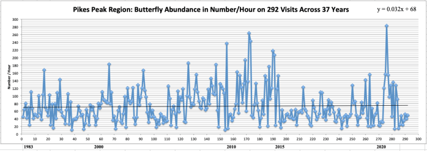
This shows an almost flat line, but slightly increasing (from 69/h to 78/h). But when I restrict the data to only Bear Creek, where I have spent most of my time, we find: a negative slope (from 87/h to 80/h). And when graphed according to the average number per hour for each year, we get:
 a more negative slope (from 102/h down to 79/h). This is surprising to me, as 11 years at an Austin Bluffs site shows no such decline:
 even when plotted according to annual averages:
 I also created box and whisker plots for the numbers of butterflies per hour for each summer month in Bear Creek!

In sum, butterfly numbers appear generally stable in this region, but further study is always needed as we enter a hotter earth with more fires.
